

![]()
As human beings, we’re drawn to pictures. Well-crafted visuals can aid storytelling and attract eyeballs. They can also help to distinguish our brands. Good graphic design really matters — especially now. Between the extremely active blogosphere and 24×7 social posting, the use of images on the Internet is red-hot.
Laughing Stock
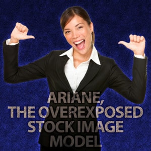 Back in the day, it was cool for firms to use stock photography and stock art. Companies like Comstock and PhotoDisc were the Art Director’s lifeline. Eventually, overuse of stock images created an atmosphere of confusing overfamiliarity. The brand avatar for a bank in New York could also show up in an ad for a Russian grocery delivery service. Which is how the phenomenon of Ariane, the Overexposed Stock Image Model came about. Now, in an age where originality an authenticity in marketing is expected, those plain vanilla photographs of professionally coiffed folk in unnatural poses have now become objects of scorn and ridicule. In 2015, there even was a movie marketing campaign that made fun of generic stock photography.
Recently, many voices have been decrying the use of stock art in favor of creating original photos and art. (I recently attended the B2B Marketing Exchange (formerly Content2Conversion) conference where David Meerman Scott took a jab at stock photos). There’s also been a trend toward alternative free stock photography as a response to “traditional” stock art. Resources like Unsplash, StockSnap and the aptly-named Death To The Stock Photo offer a more naturalistic, homespun approach to the genre. These sites have quite an array of aesthetically pleasing and creative photos. The thing is, as these sites become popular, the danger of seeing the same photos across the Web looms large, repeating the problem we now have with the older stock art sites.
Creating Original Work from Stock Art
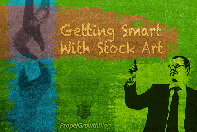
Many of us have made a significant investment in stock art, so dumping it all seems impractical. But don’t despair; there are ways to extend the value of stock art while maintaining an air of originality. Let’s explore one possibility by using the mashup illustration featured in this blog post.
Since I use Adobe Photoshop, this tutorial will demonstrate that application’s features. However, this is a visual idea that can be produced in any decent image manipulation program. All images used in this demo were purchased from Shutterstock.
Step 1: A Little Background
Let’s begin with the background. Since this is a tutorial of sorts, I’ve selected a chalkboard texture (Shutterstock #48808879).
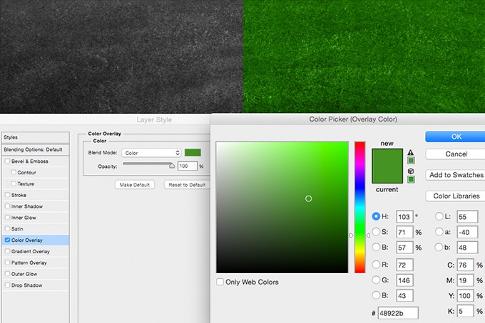
On the left is the original artwork. On the right, apply the Color Overlay Layer Style. By clicking on the color swatch area, add the green hex color #48922b (RGB and CMYK values are shown). Change the Blend Mode to “Overlay” at 100%.
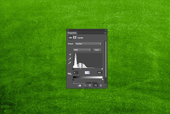
Step 2: Do the Lighten Up
Let’s lighten things up a bit by adding a Levels adjustment layer. Here, I’m tweaking the mid-range levels (and later, adding a little bit of a blur).
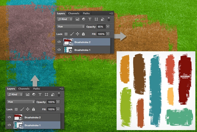
Next, we’ll pull the teal and red brushstrokes from an Adobe Illustrator EPS file (Shutterstock 144186901). With Illustrator open, copy each stroke and paste into Photoshop as a Smart Object (a Smart Object will retain the qualities of the original, such as color). The teal stroke uses the Hue blending mode at 100% opacity. The red stroke uses Hue at 60%. What’s nice about Illustrator vector graphics is that they retain the same resolution no matter what the size. That means you can size them up or down and maintain the same image quality.
Alternately, a paintbrush or shape layer can be used to provide a stylized splash of color.
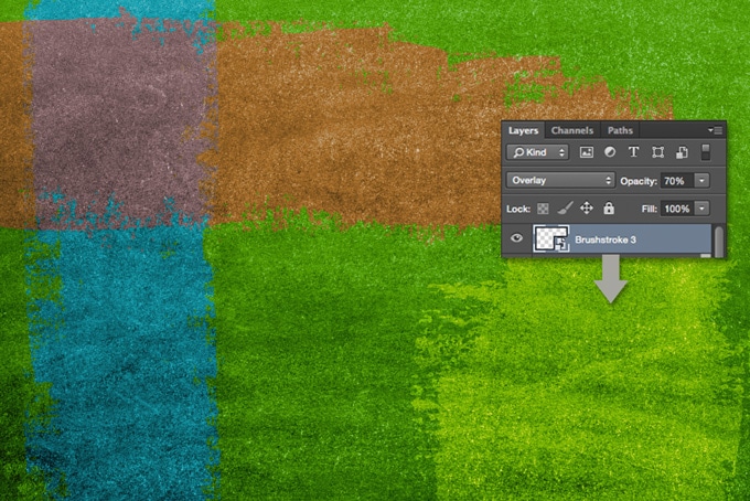
Using the same importing method as the other two brushstrokes, we’ll take the light beige stroke and place it. The Overlay blending mode at 70% opacity will work well for this one.
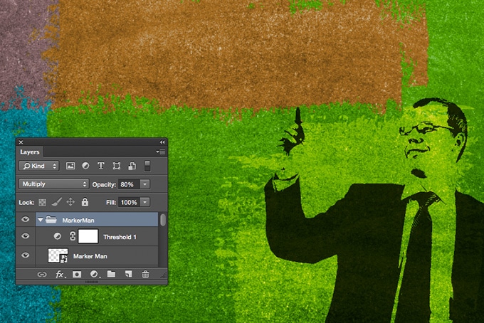
Step 4: Threshold Man
When using photos of people, you don’t just have to use the full color version. There are various ways of modifying faces and figures to fit within a prescribed style. Since we’re going for a funkier graphic look, this recipe calls for a bit of reduction.
Let’s use an image with a flat white background. A figure from Shutterstock #121125265 should do just fine. Since it will be a high-resolution image, you might want to reduce it in size by 50%. I like to convert the photo into a Smart Object so I can play around with resizing without compromising image quality.

For this next part to work, you’ll need to create a folder and place both the photo and a Threshold adjustment layer in a folder together. Make sure that the enclosing folder reads “Multiply” instead of “Pass Through” or the other elements in the illustration will be affected. Because the Multiply blending mode ignores all white areas in an image, you don’t have to do the work of silhouetting the figure from the background. Sweet, huh?
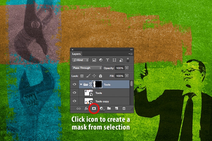
Part 5: Tools of the Trade
Let’s take a couple of object images and crop them. Here, we’ve got portions of Shutterstock #231728917 that we need to mask. Place them in a folder together…
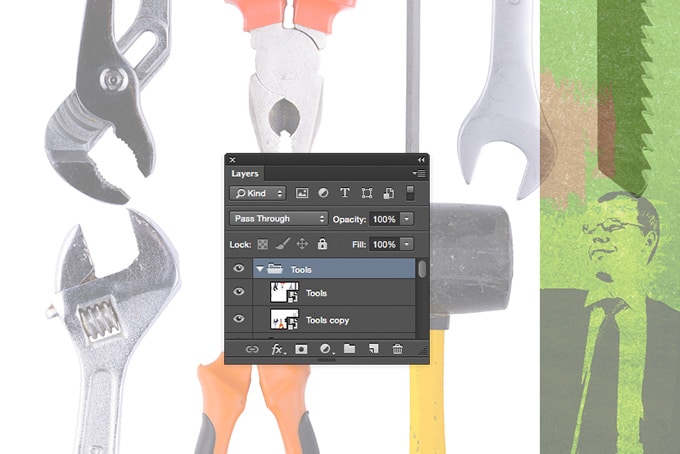
…Apply the Multiply blending mode to get rid of the white backgrounds of the images. Reduce the opacity a bit so that they blend in. Create a vertical selection around the pliers and wrench. You can either use the Marquee Tool or use the vertical brushstroke to create the selection. While the selection is active, highlight the enclosing folder and click the Add Layer Mask icon.
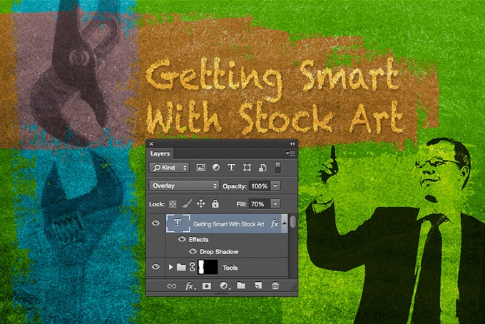
Step 6: Word ‘Em Up
Hey, let’s add some text to give this illustration a bit more context. Add some white text. Apply the Multiply blend mode, reduce opacity on the Fill to 70% and add a drop shadow. How easy was that?
Keeping It Real
We could go on and add the light bulb element and logo, but I think you get the point. This illustration is one of many approaches to stylizing your content with customized stock images (you can view other possibilities in our blog archive).
Think about the possibilities with the stock art you have on hand. How can you combine them to strengthen your brand’s identity?
Just as your brand should have its own written voice, your graphic design needs to visually reflect the tone of your brand. Make sure to apply your visual aesthetic to video content too. Keeping it real, with style will help to distinguish your brand from others that employ crappy graphic design or just don’t care to use it at all.
If the process demonstrated above is beyond your capabilities, share this blog post with your external graphic design resource(s). It could spawn some useful ideas. If you don’t have a graphic design resource, give me a call at 970.300.2280. I’d love to discuss the possibilities with you. It’s what I live for. 🙂
- Happy Holidays and Compassionate New Year – December 24, 2018
- Happy Holidays and New Year! – December 22, 2017
- Announcing The TrendSpotters Podcast – April 18, 2017


